Friday 19 April 2013

Audience Feedback

I asked Ella Robertson, aged 17 who is also a media student, what she thought of my magazine. This is what she said:

"To start of with i think that the main image being on top of the masthead is really great. It makes the artist really stand out, but it doesn't block to much that you can't read what the masthead is. Then the small cover line underneath I think draws you in quite a lot because you feel as if the magazine is going to be really good, and if it is good then the reader is happy that it is a weekly magazine. The cover lines all look great and I like the consistent style used on all of them. One of my favourite parts of the cover though is the name and all the text right underneath it. It is very obvious it is about the girl in the picture and also the main article in the magazine. This is obvious because it is right on top of the girl.

I think the contents page is very cool. The main picture is really good and eye catching, although you can't see the girls face it is still obvious it is the same girl that is on the front cover. I also like the circular picture of the other girl under the 'reviews' section, really stands out. I think that the black boxes with the white text as headings go really well on the page and make it look very professional. I also really like the face that the whole 'Emiline Blue' part under 'Interviews' is in the same fonts and colour as on the front cover, its keeping the same style as the front cover and adds to the professionalism.

The double page spread I think is simple yet effective. The pictures all look great, especially with the black and white effect and white boarders, again makes them look like professional pictures. I think the fact that the title and 'Unplugged Exclusive' all being the same fonts as on the front cover and contents page is very professional as it sticks to the same style throughout and once again links all the pages together. One of my favourite parts on the page is the bigger and blue 'E' in the same font as the title. This is what all professional magazines do but it is linking it to the title and therefore the contents page and front cover. Finally all the quotes being in blue, bold and italics font looks amazing on the black background. It stands out so much and makes it obvious where the quotes are. Looks very professional. Well Done!"

Final Product Evaluation

Initially I made my evaluation as a powerpoint presentation but I couldn't upload this file onto blogger so I saved each slide as a picture. This is them in order:


Audience Research

This is the audience research I did before starting making my final magazine:
 I asked James Bartlett, 16 years old what he would want from an acoustic magazine, these are the points he said:

- nice clean layout, neat and tidy throughtout
- easy to read
- contemporary photographs
- consistant style throughout the magazine
- clear target audience
- good price
- competition
- interesting articles

I then asked Ella Robertson, 17 years old what she would want:

- celebrity interviews
- top charts
- gossip
- cheap
- weekly
- lots of images
- competition

Friday 8 March 2013

Draft & Evaluation


This is the draft I have made for my final Product. I like the title of the draft because although it is just a white font the purple glow underneath it adds some colour and variation to it, it also makes it look much more interesting and eye catching. I have then carried on using purple on the cover and I have used the same colour in some or parts of the cover lines. This is so I can carry on with the same theme in other place on the cover so again it looks more interesting than just the grey background and the white title and black texts. I think the main picture is a good picture because there is direct mode of address, she takes up a lot of the space and people would catch peoples attention. The smaller pictures are also good because they show other aspects to the musician and how she can play other instruments, this then links to the cover line about new tallent and how lots of people are very tallented. 

Some of the features I may change when I make my final product would be I would try to have a much more interesting background as it makes the cover look a bit boring. I may also try to make a cover with just one big picture on the front that takes up even more space and then try to place text around that and see what it looked like. This may look more professional than having one picture in the middle and then two around it. I will also add some banners at the top or bottom of the final product so I can carry this on throughout the magazine and keep it as a house style, this also makes it look more professional. I will also be adding small features such as a barcode, Facebook and Twitter logos, price and other small little things that again make it look more professional. Finally I think I would try and use more interesting colours than a grey-ish background and perhaps try and edit a picture to have a better background or to have one feature that really stands out with a bright colour for example.

feedback:
"I think that possibly the title could be a little bigger and streched down to make more of a statment headline. Another thing you could look at is maybe a line at the top, bottom or under the title which you could carry through to the other pages which would make the magazine seem like it all links together well. I really like the pink drop shadow on the title as it cathes your eye well, and I also love the photographs that you have taken as they are really good unusual and interesting angles".


Mock Up 1


This is the first mock I have made. It just shows a very basic layout idea of where different elements of the page will go. This is the first of 3.

Feedback:
"The good parts of this mock up are the positioning of the main image, the title and the barcode. However, the straplines and the small images should be on seperate sides of the page and maybe you could include a banner."

Monday 4 March 2013

Mock Up 2

This is the second mock up I have made for my final product.

Wednesday 27 February 2013

Transcript

This is a transcript of Pip Marsden and what he said he would like from a music magazine. I asked Pip because he is a teenage boy who would read a music magazine fairly regularly, this is what he said:

"In a magazine I would like lots of different images and variations in the shots used. Different shots used should include long shots, close ups, high and low angles,  etc. Different images being used are key. Using different images on a page are good because people like variation and if there are too many pictures on a page that are the same the reader wont find the page as interesting and so would be less interested in reading the article on the page. Another way to make the reader want to read that page is to make it eye cathcing. Bold titles, catchy pictures and extra features on a page that catch the readers attention are great because it makes the reader interested in what the page is about. Then there must be an interesting article. It must be interesting right from the begining. This is because if the first part of the article is really boring and dull then the reader isn't going to want to carry on reading if they feel it is going to be the same. One final feature that I like in a magazine is a title that then fits the theme with the rest of the double page spread. I like it when there is a house style as it links different parts of the page together"

So far.....

What I have already done- ensuring my time is used effectively.

So far for our music magazine I have:
- The preliminary task - This was the school magazine where we started to learn how to use InDesign and we got a feel for how to make a magazine.
- Evaluation - I then evaluated this task and said what I liked and disliked about the cover we made which should then give me some ideas of what to add/how to make the final magazine.
- Format Research - This was where I evaluated 3 front covers, double page spreads and contents pages. These gave me plenty of ideas of what to have in my final product but also how to lay out some of the pages so they aren't all sqaure on.
- Evaluation of Format Research - This was where I took pictures of different features from a variety of magazines and said what I like about it. This gave me more ideas of features to add to my magazine.
- Photoshoot - I have done one photoshoot and got quite a few good photos, but I may do another one as some of the pictures are very similar and some of them the model looks like they are in sixth form clothes so I would take more photos outside of school so that I could choose much better costume.

Monday 25 February 2013

Magazine Names

These are some magazine names I have thought of for my final product....

acoustics
unplugged
fret
frets
fret board
strings
Surreal Sounds
Mahogany


Feedback and suggestions welcomed!

Votes:
Acoustics - 4
Unplugged - 3
Fret - 0
Frets - 1
Fret Board - 0
Strings - 1
Surreal Sounds - 3 
Mahogany - 0

Friday 15 February 2013

Final Photo 1


This is one of this pictures I have taken for my magazine. I liked this picture because it is a high angle and the model is holding the drumsticks in both her hands. Her she is looking straight at the camera and her eyes stand out quite a lot. I then edited this picture (as showsn by the picture om the right). Firstly I edited the background. This is so it was the same colour for the whole backgorund but also because the floor was dirty and this wouldn't look very professional on the cover. It also allowed me to make the background slightly lighter as I thought it was a little too dark. This is just one of the pictures I took and I will upload more pictures that I took before they are edited.

Sunday 10 February 2013

Ideas

After looking through some other magazines I have had a few ideas for features of my magazine. I liked the idea of having the first and second page integrated like in the Classic Rock magazine. I also really liked the 4 circular pictures in the corner of one of that pages in a magazine I saw. I could use this on either the front cover or the double page spread. I would be able to make it suit the genre of my magazine and it should look good. I also really liked the bold page numbers. I am certainly going to use this in my magazine as it looks professional. I'm also going to use the big title in the middle of the double page spread too because it shows the title is relative to both pages and not just one page. One final thing I have got from looking through the magazine is to use lots of color on the page. I need to make sure that I only use a few colors so that it looks proffesional but so that the page looks a lot more interesting and makes people want to read it.

Magazine Features


This corner is good because it shows that this magazine is using social networking sites such as Facebook and Twitter to promote their magazine as well as other things like extra stories, posting videos and pictures, etc. This will attract the readers attention because the blue box is a completely different color to the rest of the page. The words 'JOIN US ON' also attract the readers to the blue box because they want to know how else they can join the magazine even when they are on the go by using these social sites on devices such as their phones. 


This title is good because the two parts of the word are in different colors, meaning they are read as two separate words even though the reader knows its one word. Also because it is in the middle of the double page spread it shows that it is the title for the contents of both pages. 


These circular pictures are good because they are different to what you would normally see in the magazine and attract the readers to the pages that the pictures are relevant too. This sort of thing may be good in my magazine as it will make it look more proffesional. 

Page Number & Badge


I like the bottom corner of this magazine because the page number is big and bold and obvious for the reader see. This is good because if they see an article they want to read on the contents page it then isn't hard to find when they flick through the magazine. Having the date in the corner as well indicated which issue they are reader all the way through, it makes it look more professional. 


I like this badge on the front cover of the magazine because it looks like a sticker peeling off the cover. This is a good feature because it adds variation to the cover and draws the reader to what it is saying. 

NME cover


I like this cover because it is quite dark. This makes the magazine and the man on the front cover mysterious and makes the reader want to know what it is about and is another reason to buy it. I also really like the black and red theme on the cover, the red stands out a lot and emphasizes the red writing against the white writing and makes the reader read the white writing so the reader finds out a bit more information. 

Barcode

I like the barcode of this magazine being in the bottom corner because it is very discrete but everybody will know where it is and so will easily know the price. Also £3.99 is a good price for a magazine and this could help me choose the price of mine.

Classic Rock


These are the front two pages in a magazine called 'Classic Rock'. I like this idea because the front page is designed to look like a record sleeve where you can see the middle sticker of the record and the second page is the record that would be in the sleeve. I like this because it is very different to what magazines normally look like.

I also like the various cover lines on the front page as they suit the 'rock' theme of the magazine. They are all different styles, shapes and sizes which adds more variation to the page and makes it look more interesting for the reader and may make more readers pick it up and buy it.

Thursday 7 February 2013

Final cover idea

One Idea i have had for my front cover is someone to destroy a guitar!! One idea would be to smash it or burn the headstock!! I would use a burst mode on the camera so that i would capture every moment and i could then either put then together or choose the best one!! This is one of the ideas i have had for my front cover!

Friday 1 February 2013

'Classic Pop' magazine front cover review


This is my analysis of the magazine cover 'Classic Pop'. At the top is the cover with my analysis and below it is a bigger picture of the cover itself. 

NME Magazine Front Cover Analysis - Muse


Main Image: They dominate the front cover because they are taking up the majority of the space. They are used to attract readers because they will be what the audience want to read about. There is a direct mode address because all three of the musicians are looking straight at the camera and therefore straight at the reader. The background of the image is the same as the background for the cover; this makes them a part of the magazine and not just a picture. The colour orange is quite a happy colour and generates a good mood with the reader and makes them want to find out more about muse and their ‘most ridiculous tour ever’. The other wiring is mainly in white and orange to, again quite happy colours. This is because Muse aren’t the sort of band that are really dark, they are the opposite to a band such as Black Veil Brides who would have a very dark background because it’s audience wouldn’t want a bright background, but the light background suits this cover very well as the listeners of Muse wouldn’t want a dark and depressing background. The main image is of all 3 band members crouching down on the floor, but all slightly differently. Two of then are resting their arm on their knee and the other one is crouching down less, so his back is more arched. This could be trying to portray that they are a chilled out and relaxed band and not like a Death Metal type of band. They are all wearing dark jackets and trousers and two of them have a white t-shirt visible. Two of them are also wearing smart, dark shoes and the third one is wearing converse, much more casual shoes than the smart shoes. Two of them have short hair with not a lot of style and the third has quite scruffy ginger hair, again showing more of a relaxed mood. The page is organised with:
-         A strapline at the top talking the return of the Rolling Stones with a small collage next to it on the top right corner containing 2 photos.   
-         The masthead is in the top left corner and underneath it the cover lines. These give the audience a good idea what will be included in the magazine. It is often talking about some of the current affairs in the world of music and so this may be what the audience want to read about.
-         Cover lines down the left hand side. They aren’t spread out over much of the page because the picture takes up a lot of the space on the cover and there was a column of space down the left hand side.
-         The image together with the masthead is what draws the audience to the magazine because it’s what the readers want to read about. The picture is what the audience will see first and then the masthead and main cover line confirm what the picture is about and therefore make people want to buy the magazine.

The sort of language used on the cover of the magazine is quite short and informal. All the cover lines just a few words long so to give the reader a teaser of what’s inside but not to ruin what is inside. It gives enough information to make the reader more intrigued and want to read the whole article instead of them feeling like they know enough just from reader the cover line. Then the longer sentences about Muse’s new tour also makes the readers even more interested. It hypes up the tour a lot and makes people not only want to read the article to find out more details but also attend some of the world tour.
The mode of address is very informal because it is about a rock band, and normally people within a rock band aren’t seen as being posh or well spoken, so nor would the readers of the magazine be.
Overall the impression the magazine gives Is that it is going to have a lot of articles the audience would find interesting and then want to buy. The magazine is probably designed to appeal to quite a wide audience. I think it could stretch from teenagers to older men, so the ages from about 15 – 45. This is because older men not much older than 40 do also enjoy this sort of music and also a lot of the articles that would be included in the magazine.

Wednesday 30 January 2013

Evaluation

This is the final version of our school magazine front cover.

Positives:
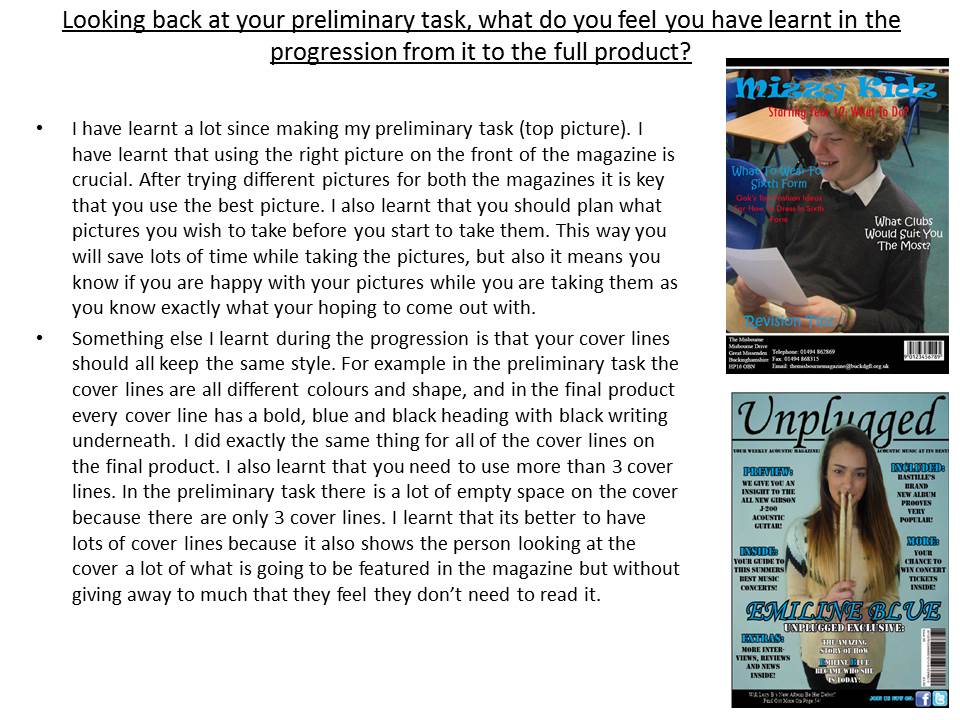
- The t shows the magazine is aimed at young people. This is because it is called 'Mizzy Kidz'. This would attract younger people more than adults because adults would want a much more formal name. Also it is in a very funky and informal font. This is also aimed more at younger people because older people would a much smarter title name. Finally it is in a bright blue color which would again attract a younger audience because they would find darker colors more boring and would make them less likely to want to read the magazine.

- The cover lines are all to do with a school and would suit the sorts of things students would want to read about in a school magazine. They are talking about what to wear in sixth form, what school clubs would suit students and revision tips. All the sorts of things that would be expected from a school magazine.

- The picture on the magazine cover shows a sixth former reading something in a working environment and clearly enjoying it.It also shows desks and chairs in the background and also you can sort of see some students in the background. All of these add to the idea that the school is filled with lots of hard working students. Exactly the sort of thing a school magazine would want to portray to any readers.

- The cover also has the schools address, contact number, email address and a bar code. These are a great thing to have on the bottom of a magazine because if any students needed any of this information it would be available very easily. It also makes the cover quite formal because it has got useful information before you have even opened it.

- The fact that this information is on a black background with a white line at the top also makes it more formal and more professional because its the sort of things proper professional magazines would include. It is also quite short and sweet and so all the required information is condensed into one place and doesnt take up too much space.

- The color of the cover lines are great because they are much more fun and interesting than using black and so would hopefully attract more readers as they feel it was aimed more at them that adults. The fonts are also good again because they suit younger people and not adults. We did keep to the same color in the masthead and cover lines which is good because it shows a constant theme.

Improvements:

- The thin black banner right at the top of the banner could have something like a headline or a price inside it so it doesn't look as empty. This would also be some great and interesting information to add to the front of the magazine to draw more readers to it.

- The picture shows the boy doesn't have his top button done up so to improve we could have taken another similar picture but with his top button done up as it would have made him look even smarter.

- Another improvement we could make would be to focus on one area of the school. The masthead and some of the cover lines are aimed at some younger years and yet the picture and other cover lines are aimed at sixth formers. We could have focused on one year by for example having a smarter masthead font and changed the name to suit an older audience such as sixth formers. We could have then changed some of the fonts used in the cover lines and also their color to suit the older students.

- Some of the colors of the cover lines clash a little with the background colors. They aren't un-readable but it may have been a good idea to spend some time on some of the colors so it is even clearer to read than it already is. It is mainly the red colors that are hardest to read so they are the ones that could possibly have been a more suitable color depending on the background.

- Finally the barcode at the bottom, although does look professional, especially on the black background may not be suitable for a school magazine. This is because they are normally free for anyone to pick up, and if they do cost money the buyer normally just gives change and there is no need to use a scanner to sell it, as most schools wouldn't have the equipment such as a till and scanner a barcode may be a bit pointless but none the less it does make it look more professional.

Any other feedback on the cover would be greatly appreciated!!

Saturday 26 January 2013

 This is the picture we decided to use on our front cover. This is because the boy looks very happy and like he is enjoying what he is reading and learning about. We decided this would be the picture that portrays the school in the best way and that is what the magazine would be trying to do. The picture below shows an edited version we tried to make so that you couldn't see the tables and person on her phone in ht background. That is how it turned out and after making the front cover with that picture we decided it looked too empty to we put the original back in but cropped out the person with their phone. Then we moved a few bits around, changed the color and size of some text and added a few other bits.

The final cover will be up soon.

Pictures


There are some of the pictures I took for our magazine cover. We have used a few shots such as a low shot, close up and over the shoulder. Together they show different perspectives. The low shot emphasizes the sixth former working at his computer and how much he is concentrating on the work he is doing. The close up focuses on the book the boy is reading and also how much he is also concentrating on it. The over the shoulder shots make the reader feel as if they are in the position of the person in the picture because they can see what he is either reading or what he is doing on his computer. The effect of the first 2 pictures are it makes it look like the students work and focus very hard on their work. It doesn't show him being distracted but focusing only on his computer. The second 2 shots also show that people in younger years than sixth form also focus hard on what they are doing because he is reading a book with his head down so it looks like he interested in nothing else than that book. Then the last 3 photos  again make it look like the students concentrate on their work very hard but also do lots of good quality work. It also shows them enjoying what they are doing by the big smile on his face in the last picture.

The range in pictures also show how I took into consideration different ethnicities. We didn't only have caucasian people, we also had a boy from an Asian background. What I didn't do though was take many pictures of females. In this post all the pictures are male orientated but a photo I posted before was of a female. This makes me realize next time I have to take pictures for my next magazine cover and contents to get more pictures of females as well as males depending on what sort of magazine I am making.

I will post the final picture we chose shortly.

Friday 25 January 2013

Feedback

We showed our teacher what our front cover so far, some of the ideas she said to add was....

- change some of the text colour so it matched other colours but also looked much better with the background colours.
- make the title larger.
- move some of the text around because the background changed.
- add a couple of pictures on the right hand side of the cover so that it looks a bit more full.

We will be uploading the final cover very shortly.

Monday 21 January 2013

This is another school magazine front cover I have found. It's masthead is 'backtoschool' so this shows it is the first magazine published after a holiday such as the summer holidays. It does have a direct mode of address which the last one didn't. This means the picture on the front almost engages the reader because they feel the person on the front is looking directly at them. It's main cover line is 'first day Jitters'. This means that the main article is about people being nervous on their first day at that school so it may be giving them advice about how to overcome this nervousness, this would be attracting the audience of the new people at the school. The cover lines include titles such as 'Breakfast, Lunch, Snack', this could therefore be giving people advice on how to eat a bit more healthily instead of eating junk food, something of which a lot of teenagers would consume on a daily basis. There are then other cover lines that talk about tips about how to have a lighter school bag or some of the top 10 gadgets. These would all be ideal articles for the magazine because they would all be subjects that the students would be interested in. The magazine doesn't have a barcode on it which suggests it cannot be bought, so it is only available in school and that it is perhaps free.

This magazine has given me a few good ideas for my magazine In that students would be interested in things such as gadgets and making their bags lighter so I could use subjects similar to this!
 

Saturday 19 January 2013

Draft Front Cover

This is a very basic first idea of how the front cover m
could look. It only shows that it will have a masthead which me and Lauren have already decided will be 'Mizzy Kidz', the strapline that will draw the readers attention to the magazine, the direct mode of address will be a picture of someone looking at the reader and it will have 3 coverlines around the direct mode of address of some of the stories that would have been included in the magazine. These could include anything such as exam results, trips, events the school may be putting on or anything that is relevant to the school that the readers will enjoy reading about. We would also add in a main coverline because this will also draw the readers to the magazine when they see it. It will have to be something that they would enjoy reading or else they if they saw it and weren't interested they wouldn't pick it up to read it.

Friday 18 January 2013

Pictures

This is one picture I took today. I have decided not to use this in my final front cover, one reason is because it is quite boring and wouldn't attract people to the magazine. It is also looks a little bit scary and so again would put people off picking up and reading the magazine. Another reason I might not use this picture is because it isn't portraying any sort of message of the school and we need a picture that would represent the school as being a good, friendly place for people to learn!! I will be uploading some more pictures soon!!

Uploading

In the lesson today I have taken some pictures of various different people doing differant things such as reading and typing and used some differant shotas for some variation. I have also done a plan for an idea for a front page so I am waiting for lauren to do one and they will both be uploaded. I will also be uploading the pictures I took and write about which ones are good, which ones aren't good and which ones I might use in my final product.

Monday 14 January 2013

Magazine analysis

This is a school magazine front cover I have found. Initially it seems like it is aimed at kids, probably between the ages of around 12 - 15. This is because it is quite colorful and looks a lot like a paper collage. It also shows young people doing lots of activities such as swimming, athletics and many other sports. But the text in the middle although is on what looks like a scrap piece of paper it is very formal writing with a logo next to it. This might imply that it is aimed at a much older audience, perhaps the parents of the children. So for this magazine it is hard to tell who it is for but it does give me an idea of what sort of fonts not to use if I want my magazine to be aimed at students. It shows me that I don't want to use formal fonts on my front page if I want teenagers to read it. It has also shown me that using a collage of pictures does appeal to a younger audience because it is more fun than formal.


Friday 11 January 2013

Preliminary Task

For our preliminary task we have to work in pairs to design a front cover for a school magazine. Those of us who don't know how to use the software called 'InDesign' pair up with someone who does know how to use it. I have partnered with Lauren who will hopefully teach me how to do the basics. We have already decided the magazine will be called 'Mizzy Kidz'. The will hopefully be seen as more of a 'street' way of saying 'Misbourne Kids' and should hopefully appeal to the younger audience within the school. We have started using a font called 'Ravie'. This is because it looks much more informal and should again apeal to the younger audience but this isn't the final choice, we will have a look through some more fonts soon so that we have a choice of fun fonts to use. Right now we are trying to look at some current school magazines to analyse them so we have some good idea of how to make our own look!

lesson 1.

Today in the lesson we are looking at some magazines set by the teacher and within a pair we are analysing it and posting it on here.