Monday, 14 January 2013
Magazine analysis
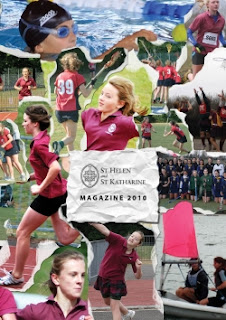
This is a school magazine front cover I have found. Initially it seems like it is aimed at kids, probably between the ages of around 12 - 15. This is because it is quite colorful and looks a lot like a paper collage. It also shows young people doing lots of activities such as swimming, athletics and many other sports. But the text in the middle although is on what looks like a scrap piece of paper it is very formal writing with a logo next to it. This might imply that it is aimed at a much older audience, perhaps the parents of the children. So for this magazine it is hard to tell who it is for but it does give me an idea of what sort of fonts not to use if I want my magazine to be aimed at students. It shows me that I don't want to use formal fonts on my front page if I want teenagers to read it. It has also shown me that using a collage of pictures does appeal to a younger audience because it is more fun than formal.
Subscribe to:
Post Comments (Atom)

No comments:
Post a Comment